9/28/20
Over the weekend, we were asked to collect information about our typeface, most specifically — really understand the typeface’s personality and history. As a result of our research, we had to hand in a short essay, a list of adjectives, as well as a short statement that best encapsulates the font’s entirety.
Serifa was designed by Adrian Frutiger in 1964 and released by the Bauer Type Foundry in 1967 in Switzerland. It was mainly created with the intent of clarity and to bring visual aesthetics in type. The purpose with legibility in Serifa was inspired by the Swiss movement (1940s-1970s), which was a time where designers believed that design should be more direct and intentional as opposed to creative and expressive like in fine arts.
It has unbracketed square serifs, shorter x-height, and boxy capital letters.

Adjectives:
- Eye-catching/bold
- Contemporary/popular
- Humanistic
- Legible
- adaptable/flexible/multifunctional/versatile
- Geometrical
It is a slab-serif font and it is available in 6 different weights. I tried experimenting with the different weights to see the different effects it had.

50–60 Word Statement:
Eye-catching. Legible. Flexible. Designed by Adrian Frutiger in 1967 in Switzerland, Serifa’s geometric skeleton has proven itself to be timeless throughout the years presenting itself in magazine layouts, newspapers, company branding, and college board tests. The spacious gap between the letters make Serifa friendly to the eye and welcoming. If Serifa was a friend she would be bold, direct, confident yet down to earth and like plants. She wears glasses and likes books. She would be easily adaptable to any situation from serious business meetings to fun, quirky hangouts.
9/29/20
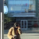
From Tuesday to Thursday, we were asked to experiment with type and legibility using the essay we wrote about the font. I collected potential images that I might use for my spread. Because Serifa is a geometric and very straight font, I wanted to collect images that reflect these characteristics. Here are some of the potential images that I collected:


I tried staying away from geometric shapes with curves in them because Serifa has unbracketed serifs. I plan on incorporating these images with color or maybe faintly in the background of my spread.
Initial Sketches


For the sketches, I tried playing around with the different ways Serifa could be displayed as a word. I explored the position as well as the different dynamic positions the letters could be positioned to create interesting composition.
Type Exploration
Goal: Set text in various column widths and establish the most comfortable type weight, type size, leading and measure for body copy. Do the same for any secondary or tertiary text styles (ex. headlines, subheads, captions).


From these various iterations, I realized that my two paragraphs are too long that makes it difficult for reading. I divided into four paragraphs and explored legibility with them.


After printing some of the iterations out, I really leaned towards the font 10, 15 point leading. It was a good size for the body paragraph, small and non-distracting from far away but clear up-close.


I am leading towards the example on the left because the one more gutter has the line width that is more standard for reading. The right example is a little too narrow. Although the width of the paragraph is uncertain as of right now and depends on the composition/imagery/ and other components of the spread, I will stick to font 10 and leading 15 for my body paragraphs.

With the spread and essay, I want to focus on a narrative or a main focal point. I want to carry on and emphasize the personification of the font Serifa. So far, I personified Serifa as a strong boss woman but I need to figure out a reason why I chose to display the font as woman and not a man. Using this idea and focal point I want to figure out a way to display this narrative clearly with intention.
First Round of Iterations:
Staying consistent to the narrative I wanted to tell, which is personifying ‘serifa’ as a strong boss woman, I used a variety of methods like bold colors as well as a silhouette of Audrey Hepburn in the back. Because Audrey Hepburn is known to be bold, elegant, and eye-catching, I thought she was a good figure to have in the back. I explored a variety of compositions and tried to use the catchphrase “She means business!” as the main theme for many of the compositions.


I tried playing around with the composition of the letters as well, changing up the scale. This resulted in a more playful look, which is different from my initial look I wanted to approach.


First Crit:
During the in-class critique today, I got feedback that using Audrey Hepburn in the back might be a little too distracting from my typeface. Because Audrey is an iconic figure in American culture, having her silhouette as the main focus of the spread and having the catchphrase “She means business” might imply that the spread is about Audrey not Serifa.
From here I knew I had to incorporate a different graphic to the spread aside from Hepburn but I still wanted to include the catchphrase “She means business” because it is interested and it captures the personality of Serifa well.


Final Poster (before video)

I thought I would be done by now but I had one more (maybe a few more) meetings with Vicki to work on my final spread. Her initial feedback about my (so thought to be) final was that it was very heavy and a lot on one page. There were many different parts of the spread that was calling attention to the eye. She also commented about the breaking of the paragraphs and how it should be more “together.” Taking this feedback, I knew I needed to change many things about my spread to make it work.
For starters I needed to get rid of one (or more) visual elements on my page.


I think this part of the project was a little hard for me because I got a little too attached too all the visual components of the page and I couldn’t decide which one to give up. Also the white space of the spread seemed a little unnatural to me when it actually helped my spread breathe a little.
My ACTUAL final spread:


I decided to get rid of the pale pink background to help the spread breathe more and become more clean. While I would have naturally highlighted all the serifs in the letterforms, Vicki advised me to pick and choose a few to highlight so that I am not bombarding the viewer like I did before. I did the same with highlighting the counters, and the sturdy stem. I am happy with the final spread and although I had moments where I was stuck, I learned through this process that I should start simple again.