Right outside University of Pittsburgh, students are scurrying to their next class, as cars and buses are trailing alongside trying to make it past the traffic light. The birds are chirping, the bus doors are closing, and the traffic lights are beeping. The peak of the intersection’s commotion comes primarily from its role as a crossway between two of the busiest streets on campus.


The intersection constantly had a flood of people flowing in and out through the several bus systems located throughout the street. Due to the importance of buses on this part of campus, the bus stops took various forms ranging from a simple sign to a glass enclosed waiting area. Buses weren’t the only mode of transportation as there were lanes separated for students who travel on bike. For commuters who walk, the area was designed to provide a convenient yet enjoyable experience by preserving parts of nature on the streets. With that being said, the intersection on Fifth Ave. and Bigelow Blvd is a fusion of man-made and natural elements to bring an experience to the commuter like none before.


Towering over the trees, the Cathedral of Learning is one of the many impressive and distinctive buildings found in the area. Not only does it serve as an educational building, but it also acts as a visual beacon for the skyline of the city. Its tall stature pulls the attention of the pedestrians upwards, giving them rest from their otherwise very hectic day.


Despite all the commotion around the area, one can always find a way to wind down and pull away from the chaotic bustle. The intersection is an essential part of this community; it is a center of endless movement and action.
and for those who like bubble tea…

SEPTEMBER 2, 2019

From the class discussions, I learned the different methods of capturing the essence of a location though photography. When I take pictures of a location, it is useful to think about what the space smells like, sounds like, and feels like. Before, I was more concerned about only the visual aspect of my photographs but I learned that all the senses play a crucial role in developing an image.


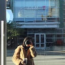
Looking at my classmates’ photographs, inspired me to focus more on the action happening in my intersection. When I went back the second time, I captured many moments of pedestrians crossing the street and students scurrying to their next class.


Before jumping into taking pictures, I first walked around to get a sense of the space I was in. I analyzed the streets with my senses to understand it not only visually but in other ways as well. The pictures I took during my second visit to my intersection has more movement. It portrays a more accurate depiction of the noise and chaos characteristic of Fifth Ave and Bigelow Blvd.


SEPTEMBER 5, 2019

Out of the pictures I took at the intersection, I picked one that I thought most accurately represented the essence of the chaos on Fifth Ave. and Bigelow Blvd. With this picture, I was instructed to use white paper to translate the photograph to to a flat image.


I first started off by determining what aspect of the picture was towards the back and what was upfront to break the image down into layers. Once I got the layers of the photograph sorted in my head, I used tracing paper to draw the segments in the back and got more detailed in my sketch as I stacked more tracing paper on top.


I also used tracing paper to draw the silhouette of objects in the picture. I used this to accurately cut out the objects. Once I had all my components, I used the layering system thought out in my head to glue everything together.


SEPTEMBER 10, 2019

My first attempt in expressing an intersection by layering white on white had to be improved for several reasons. One of them was that the relief used for the main building was too dramatic that it took away the emphasis on the focal point. I cut out too many details for each portion of the picture that it was fighting for the viewer’s attention as a whole.


For my second attempt, I focused on lessening the space between the layers of the main building, which was responsible for creating the ‘flying away’ look in my peice. I chose to stick only two layers to make up the component of the main building while for my first attempt, I used three. I also took away the stacks of paper I stuck between the layers my first try. By doing so I took away the focus from the building in the back and brought the attention to the pole and white van in the front.
SEPTEMBER 12, 2019

For this week’s assignment, I used my picture from the intersection to create a gray scaled composition with four tones of paper.

First, I sketched out all the different possible ways my picture could be interpreted in four tones. Using my gray-scaled copic markers, I set my picture on the lightbox and colored the shapes to produce samples of each possible option. I decided that using the darkest toned paper for the objects in the front was the best approach in expressing my photograph.


I went to the lightbox to trace the different components and layers.I assigned each layer to a specific tone so that it would be easier for me to cut out later on. Soon, I was left with multiple sheets of layers that would together make up my building.

SEPTEMBER 19TH, 2019
GREY SCALE + ONE COLOR

The last prompt for the intersection project was to pick one color and incorporate it into our piece. After receiving this task, I was overwhelmed by all the different colors I could choose from. I used Adobe Illustrator to test out all the colors to find the best fit.

Testing out different colors in various places throughout my work allowed me to see what was being emphasized in my composition. Because I worked digitally in this step, I was able to change colors easily without any consequences.
Out of all the colors, I chose to go with the yellow on the side of the buildings to mimic the sunlight hitting the intersection.

In my sketchbook, I figured out the layers by drawing thumbnails and color coding. This helped me organized my ideas before I started to cut my pieces out.